Captain to First Mate- The Awful Rebrand We Need To Talk About
A new rebrand has killed the iconic Captain, so I performed a post-mortem.
Captain Morgan Rum, a spirit that has been the protagonist of many a debauchery filled tale, got a facelift, and not the good kind.
No, dear reader, our seafaring Captain, a once vibrant figure seems to have walked the plank into the sea of mediocrity.
Let’s discuss this absolute mess of a rebrand.
First, the Captain himself.
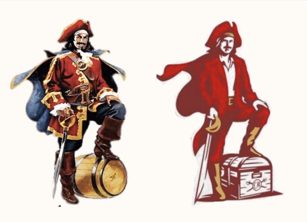
In the old logo, Morgan had his foot propped up against a barrel, face brimming with confidence, illustrated in bright colours and characteristic detail.
Now? The guy looks more like First Mate Morgan, perched on a treasure chest (?), in monotone red as a flat vectorised figure with no personality.
They took a distinctive brand asset and absolutely massacred him. Honestly, there should be design jail time for this.
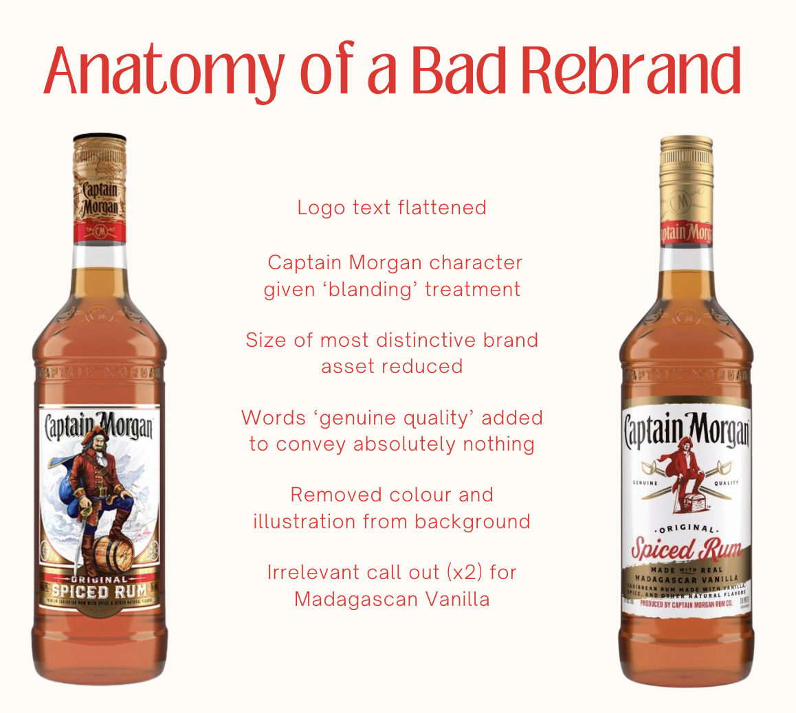
Next, hierarchy. The designers have achieved a chaotic jumble with two bizarre call outs on the bottle; the words ‘genuine quality’ and highlighting the use of Madagascan vanilla.
In an attempt to convey this 'genuine quality,' the new bottle design has accomplished the complete opposite. In actual fact, the fastest way to lower perceived quality is to scream about it from the rooftops. If your product is ‘genuine quality’ you shouldn’t have to put those exact words on the packaging.
The decision to highlight Madagascan vanilla makes little sense. And, they thought it so nice, they said it twice. WHY?! I doubt Captain Morgan drinkers care that much.
I tried to find a reason for the Captain’s demise and understand what the branding team was trying to achieve…
Samori Gambrah, Global Brand Director for Captain Morgan, claims the new design "heroes the delicious spice of our liquid and character as a brand." Apparently, this allows them the "flexibility" they need to show up dynamically in sponsorships, live events, and collaborations.
Look, I do get it. Onmichannel branding is a minefield, but just because simplicity is the easiest way to accommodate diverse platforms, doesn’t mean it’s the best.
Jo Smith, global design lead for Captain Morgan, added they wanted a "fresher, more dynamic design that puts taste and flavour at the forefront."
That's all well and good, Jo, but perhaps next time, keep the brand identity at the forefront too? It's a sad day when even a fictional pirate can't escape the corporate cutlass.
This rebrand is alarmingly consistent with the ‘blanding’ of brands we've seen in recent years. Blanding occurs when, in a desperate bid to fit in, brands lose their authenticity and distinctiveness.
These brands are often characterised by use of sans-serif fonts, limited colour palettes, simplified in appearance and generally flat. Sure, this style is current and consequently gives an element of familiarity BUT these sanitised brands are sapped of personality. Why actively TRY to blend in?
Before we raise a toast to commemorate the Captain and recognise his demotion to homogenised First Mate, what can smaller brands learn from this epic fumble?
Authenticity is Key: The Captain Morgan rebrand highlights the importance of staying true to a brand's origins and unique identity. Avoid trying to fit into a generic mold, and instead celebrate what makes you distinct and memorable.
Don’t Fix What Isn’t Broken: While innovation is important, drastic changes to a brand's image can lead to alienation of loyal customers. Be cautious about changing aspects of the brand that is already successful and well-loved.
Communication is Crucial: Captain Morgan's decision to highlight 'Madagascan vanilla' (twice) leaves me confused and unconvinced. Brands need to ensure that their messaging is clear, relatable, and most of all, meaningful to their target audience.


